Friday, December 9, 2011

Lab#8

This is our final project. In this project, we use GIS combined with other online information and data to analyze the Los Angeles County station fire in summer 2009. The fire started in August 29th and ended in September 2rd.  The fire caused a lot of damage and my study will focus on the following three subjects:

1) In which direction did the fire grow and how much area did the fire cover in different times?
2) What was the population affected by the fire and how many houses were destroyed?
3) Were there many parks destroyed by the fire and did the forests enhance the fire?
First of all, let us look at the picture above named digital elevation model of L.A County station fire. Namely, this picture shows us the relationship between elevation and growth of the fire. The different colors in the background indicate the elevation in L.A County, which is highlighted by a blue line. In the middle of L.A County, there are three ‘patterns’ colored in red, orange, and yellow representing the coverage of the fire in Aug 29th, Aug 30th , and Sept 1st respectively.  We can clearly see that the fire went northwest first and then went northeast. This observation generates two questions. Firstly, in our common sense, the fire goes from high to low areas. However, in the picture above, through the three days the fire went north, which has high altitude (in brown and white), and developed little in the southern direction (colored in green basically), which is much lower than north. Secondly, the fire went northwest in the first day and later changed its direction to northeast ---- how did this happen?
For both of the two questions, we may have a brief incomplete answer: Winds! Let me explain in detail. In “Climate of California”, it says “California lies within the zone of prevailing westerlies and on the east side of the semi-permanent high pressure area of the northeast Pacific Ocean.  The basic flow in the free air above the State, therefore, is from the west or northwest during most of the year.  The several mountain chains within the State, however, are responsible for deflecting these winds and, except for the immediate coast, wind direction is likely to be more a product of local terrain than it is of prevailing circulation.” It appears that the winds were the driving force. The western winds pushed the fire to the east, although the elevation is increasing.  Also there were other wind from the east might change the fire’s direction. One is called Santa Ana winds and it just started in Fall. The National Weather Service defines Santa Ana winds as "Strong down slope winds that blow through the mountain passes in southern California. These winds, which can easily exceed 40 mph, are warm and dry and can severely exacerbate brush or forest fires, especially under drought conditions." Santa Ana winds bring dry and warm air, which is ‘perfect’ for the fire. This explains why the fire was quickly expanding.
Another reason the fire was going from low altitude to high is that lower bushes often contain more water while plants in higher areas are often dry and ignited easily.


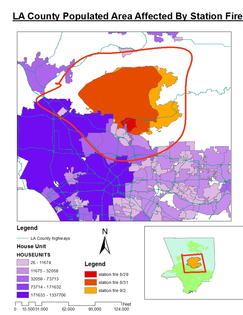
We are very interested in how the fire affected families and houses. Here we have a picture combining the distribution of population/families and the fire coverage. Happily, this time our common sense does not fail ---- People do live in plain areas not mountains!  The darker color means more people and vice versa. We can see that most families were in the left lower corner. The fire in different colors means the fire in different times. The red circle is the boundary in which people were affected by the fire. Fortunately, we find only a small portion of people in L.A County were affected by the station fire. At the beginning, the fire was very close to large population area; however, as it grew it went towards north and expanded in a direction where few people were living there. Even though the fire grew in a better way, it must have caused enough panic and fire fighters made great contribution to making sure the fire was away from residents.


Sept. 4, 5:38 a.m.: Before dawn Friday, firefighters build a small memorial to honor Los Angeles County Fire Capt. Tedmund "Ted" Hall, 47, and Firefighter Spc. Arnaldo "Arnie" Quinones, 34, who died Sunday when their truck plunged down a hillside.


Last picture is about fires and parks. Parks might have a negative effect in the station fire because the tree and woods can enhance the fire. Unfortunately, there were many parks around the fire and therefore, the fire went over them and destroyed them. A good way of thinking of this is that more parks means fewer people, thus we thank the parks for bringing the fire away from us.

This concludes this quarter’s projects. I have had a great experience with the GIS map. It not only helps us understand our world better, but also has the potential to save lives in disasters with the analysis.

Sept. 1, 12:08 a.m.: A group of young men watch the Station fire from a hill overlooking Tujunga on Monday night. (Wally Skalij / Los Angeles Times)


 Works cited
“Climate of California” Western Region Climate Center. Web. 08 June, 2011
Santa Ana winds From Wikipedia, the free encyclopedia. http://en.wikipedia.org/wiki/Santa_Ana_winds

On the fire lines
http://www.latimes.com/news/local/la-me-bigpicturefire,0,5985825.htmlstory

http://gis.ats.ucla.edu/ UCLA GIS Data archive


http://www.usgs.gov/ United States Geological Survey

Sunday, November 20, 2011

LAB #7


The first map displays the distribution of Asians in the United States. As an Asian, this map matches my impression of ‘Asian groups’.  In my map, there are 6 levels of Asians’ density, indicating the number of Asians in a county with darker colors for higher density and lower colors for lower density. As shown in the map, the Asian people concentrate in east and west coasts, while in many central parts there are few Asian people living. San Francisco is one of the cities with most Asians, so are New York and Los Angeles. Therefore we can see that in the areas mentioned, the population of Asian is in the highest level. In the place with highest rate of Asians the ratio is near half, meaning there is likely one Asian out of every two people.
 The second map displays the distribution of Black people in the United States. Like the Asians, most black people live in coast areas. What is more, there are much more black people in southern part of the U.S than in the north. This may be a result from historical reasons as we know south is the place of many slaveries. Same as the first map, darker colors indicate higher density of black people and lower colors indicate lower density of black people. Some counties in the central north have few blacks while some places have black’s ratio up to 86%.
The third map displays the distribution of some other race in the United States. This may include the Hispanic people. Darker colors indicate higher density of other race and lower colors indicate lower density of other race people.  Most of the other race people emigrated from Central American counties like Mexico. That’s why we see a lot of them in the counties in south, especially near Mexico. Also in Florida, where people speak Spanish as much as English, the color is very dark. However, the rate of other race people does not go very high, as the highest rate in the U.S is less than 40%.
In conclusion, the three maps above tell us how diverse the population of the U.S is. The places with most complicated mixture of races is near borders and coasts, where are homes immigrates most likely to choose as. However, my guess is with the time goes by, people with the particular races will scatter and move to everywhere in this country and therefore, we might not see concentrations as high as today’s. This does mean there will be fewer people in that race but a nation with better mixed population.
In this assignment, we choose the American Lambert Conformal Conic projection in GIS to show us a manifest and friendly map of population. This projection helps to explain the distribution of a particular race in the U.S with different color indicating different levels of rates. The final maps are not only easy for common people to understand, but also very clear and pretty, a feast on eyes. GIS is a powerful tool to analyze complicated geographical data and serve a very good demonstration purpose.

Saturday, November 12, 2011

lab 6

Description of the area:

The area I selected is a small region in California near the Oceanside. It is close to a small hill called evergreen. This hill is not very high but its peak is relatively higher than the  surroundings. So it is suitable to make digital elevation model (DEM). The maps below lie between 32.938 degree (top) and 32.75 degree (bottom), and-117.15 degree (left) and -116.794 degree (right). The geographical coordinate system used is is GCS North American 1983.The following 4 maps represent different views and features of the terrain. These include a shaded relief model, a slope map, an aspect map, and a 3-D representation of the model.


DEM maps:


3D map

Sunday, November 6, 2011

Lab: Projection

     Since the earth is a spherical, it is hard to correctly represent it on the 2 dimension map. There is no way to perfectly project three-dimensional earth surface into a two-dimensional planer surface. However, two-dimensional maps are very important in geographical application. So we invented lots of map projection purposes. Each of projection methods has its specific purpose and serves different function. For more effective use of map, one must pick the right projection. In this lab, I used three types of projection to project a world map; they are equal-area projection, equal distance projection and conformal projection. By comparing the differences and similarities of these three maps, I will discuss the significance of map projection.


     The first projection is equal area projection. It accurately represents area in all regions of the sphere, but it does not accurately represent angles. It accurately represents area in all regions of the sphere, but it does not accurately represent angle and size of a region. Each equal area map preserves area in a certain region or with certain conditions. Therefore it is essential to choose the right equal area projection depending on your region of focus. In addition, different equal area projection maps have different appearances. For example, Sinusoidal projection is like an ellipse. The polar areas in this projection shrink a lot. The shapes of two polar areas are distorted. In Bonne equal area map, the world is projected as a heart-shape. The north polar is distorted even more. But in both of them, the areas are accurately preserved.


     The next is equal distance projection. A useful application for this type of projection is a polar projection in which all distances measured from the center of the map along any longitudinal line are accurate; as shown above,  a polar azimuthal equidistant projection and conic projection are good examples . These two projections project the world from the north polar. In these two maps, distances and directions to all places are true only from the center point of projection. Equidistant maps both shared a common trait: their degrees of measurement from Kabul, Afghanistan to Washington, D.C. are about the same in both of the maps. Distances are correct between points along straight lines through the center. Though they are not very useful for navigation because the shapes are not well preserved, they are very useful in polar projection.


   The last projection is conformal projection. It preserves the angle and shape. Conformal map projections are frequently employed in large-scale applications, and seldom used for continental or world maps. Because the shape does not change, it is pretty useful in navigation. It is a big advantage of this projection. But it also has disadvantage; the distance and size are largely distorted. For example, 1984 PDC Mercator projection, the distance from Kabul to Washington D.C. is much longer than the distance in other maps. Furthermore,  the south polar area is much bigger than usual. In the miller cylinder projection, it is the same; the south polar is distorted and the distance is relatively larger.

Sunday, October 30, 2011

LAB 4

     This is the first time that I use geographical software. While completing the tutorial, I encountered some difficulties. One major problem is that the image in the tutorial is slightly different from my screen. For example I can’t find the toolbar in the interface. So it is a little bit hard to follow the tutorial instruction.  Another problem is that when I tried to adjust the map scale, it always jumped back to the original scale. Sometime the map would become ridiculously huge. In spite of all these difficulties, this software is relatively easy to use and it is very useful. By using this software, we can add data to a map, edit geographical data, work with table and lay out map. Another thing I particularly like about Arcmap is that user can customize his/her own map. You can change the colors and apply different shade on it. Overall, Arcmap is user-friendly and useful.
      There are both potential and pitfalls of GIS. A huge positive aspect of GIS is that it is very effective to organize and edit complex data. Lots of geographical information can be easily added to a map. Also, multiple layers are helpful in hiding and showing in important data. They are also helpful in creating a map with a particular purpose. The large range of colors and shapes that can be added on a map provide a clearer viewing to the general public. The digital map that GIS created can serve different purposes as well as help user to visualize the map. It also can be updated easily.
     GIS also has an advantage in editing, creating points, lines and polygenes. There are lots of useful tool to draw a map. In addition, user can analyst huge amount of data by creating table and separating layers. It is also very easy to view a map in GIS because you can zoom in when you want to see a specific location and zoom out when you want to see the whole layout of the map.
      There are certain pitfalls as well. I think GIS is user-friendly only because I have a tutorial to follow. I can’t imagine that I make maps on GIS if I have nothing except the software alone. GIS is certainly less user-friendly than Google map. Not everyone has the patient to get familiar with GIS operation because it requires lots of time to do so. After completing the tutorial, I still feel that I have much more to learn about GIS. GIS is only designed for those who like geography and those who are experts
      In conclusion, GIS is a relatively sophisticated software that can analyst and process huge amount of data. It has lots of potential to visualize complicated data and maps information. Although it is not as user-friendly as Google map, it is great for the academic purpose.

Saturday, October 15, 2011

week3 lab

View A TOUR TO HANGZHOU, CHINA in a larger map">


The pitfalls, potential and consequences of neogeography

Neogeography has transitioned the map making process from cartographers to the general public. Especially after some websites lilk google map has released an API(application programming interface), map making doesn't require that much acadamical understanding of the geography and expertise on cartography as it did before. Consequensely, people start to make their own maps, which maybe be less acurrate but more personal and more entertaining.  Neogeography has lots of potential on introducing geography to massive amout of people. Also as people have maken their own maps, they put lots of information on the map,like travel guide, restaurant information etc. This large volume of information sharing make mashup map more like a personal blog and social network. In a nutshell, all of this has pushed geography to the general public and has made geography be more available and understandable to normal people.

Though neogeography has lots of potential and advantages, it has some inevitable downfalls. As the application on google map is so easy to use. There is a large proportion of map makers who lack of basic knowledge of geography  making their own maps. So those maps' accuracy and reliablity are always in question. After all, map making is not just about having fun. The map we make should be useful to people instead of misleading.  In addition , neogeography might mislead people into thinking  that it can replace the traditional way of map making.

In spite of all the pitfalls Neogeography it has, it is still a pretty innovative way of providing a more accessable and easy-use geographical tool to the general public. Nowadays, geography is not a field that only scientists can set their foot on. It now has becamed a website application which lots people can easily get access to.

The impact made by neogeography are obiviously to be seen in our dialy life. It has improved our life quality in a large amout. There are boundless opportunities for neogeography in the future.

Saturday, October 8, 2011

lab 2


LAB 2 
PANQIAN XU

1.     What is the name of the quadrangle?
 Beverly Hills, CA 1995 quadrangle
2.     What are the names of the adjacent quadrangles?
Canoga Park, Van Nuys, Burbank, Topanga,  Hollywood, Venice ,Inglewood
3.     When was the quadrangle first created?
 1966
4.     What datum was used to create your map?
Horizontal datum: North American datum of 1927 and 1983
Vertical datum: National geodetic vertical datum of 1929
5.     What is the scale of the map?
1:24000
6. At the above scale, answer the following:
a) 5 centimeters on the map is equivalent to how many meters on the ground?
5*24000/100=1200meters
b) 5 inches on the map is equivalent to how many miles on the ground?
5*2.54*24000*                  0.0000062137=1.8937mile
c) one mile on the ground is equivalent to how many inches on the map?
1mile= 1 609.344meters=160934.4cm, 160934.4/24000=6.7056cm=2.615184inches
d) three kilometers on the ground is equivalent to how many centimeters on the map?
3km=3000m=300000cm, 300000/24000=12.5cm
7.What is the contour interval on your map?
20feets
8. What are the approximate geographic coordinates in both degrees/minutes/seconds and decimal degrees of:
a) the Public Affairs Building
North: 34degree 4 minute 16second=34.07
East: 118 degree,26minute 34 second=118.44
b) the tip of Santa Monica pier;
34 degrees 4minutes 30seconds North=34.075
118degrees 26minutes 30seconds West=118.44
c) the Upper Franklin Canyon Reservoir;
   West: 118 degrees 24 minutes 40 seconds   118.41 degrees
   North: 34 degrees 6 minutes 30 seconds      34.11 degrees
9. What is the approximate elevation in both feet and meters of:
a) Greystone Mansion (in Greystone Park);
570feets=0.3048*570meters=173.736meters
b) Woodlawn Cemetery;
140feets=42.672meters
c) Crestwood Hills Park;
750feets=228.6meters
10. What is the UTM zone of the map?
Zone 11
11. What are the UTM coordinates for the lower left corner of your map?
 3763000meters northing
  361500meters  easting
12. How many square meters are contained within each cell (square) of the UTM gridlines?
1,000,000 square meters

13. Obtain elevation measurements, from west to east along the UTM northing 3771000, where the eastings of the UTM grid intersect the northing. Create an elevation profile using these measurements in Excel (hint: create a line chart). Figure out how to label the elevation values to the two measurements on campus. Insert your elevation profile as a graphic in your blog.


14. What is the magnetic declination of the map?
It is positive 14 degrees
15. In which direction does water flow in the intermittent stream between the 405 freeway and Stone Canyon Reservoir?
From North to South.
16. Crop out (i.e., cut and paste) UCLA from the map and include it as a graphic on your blog.